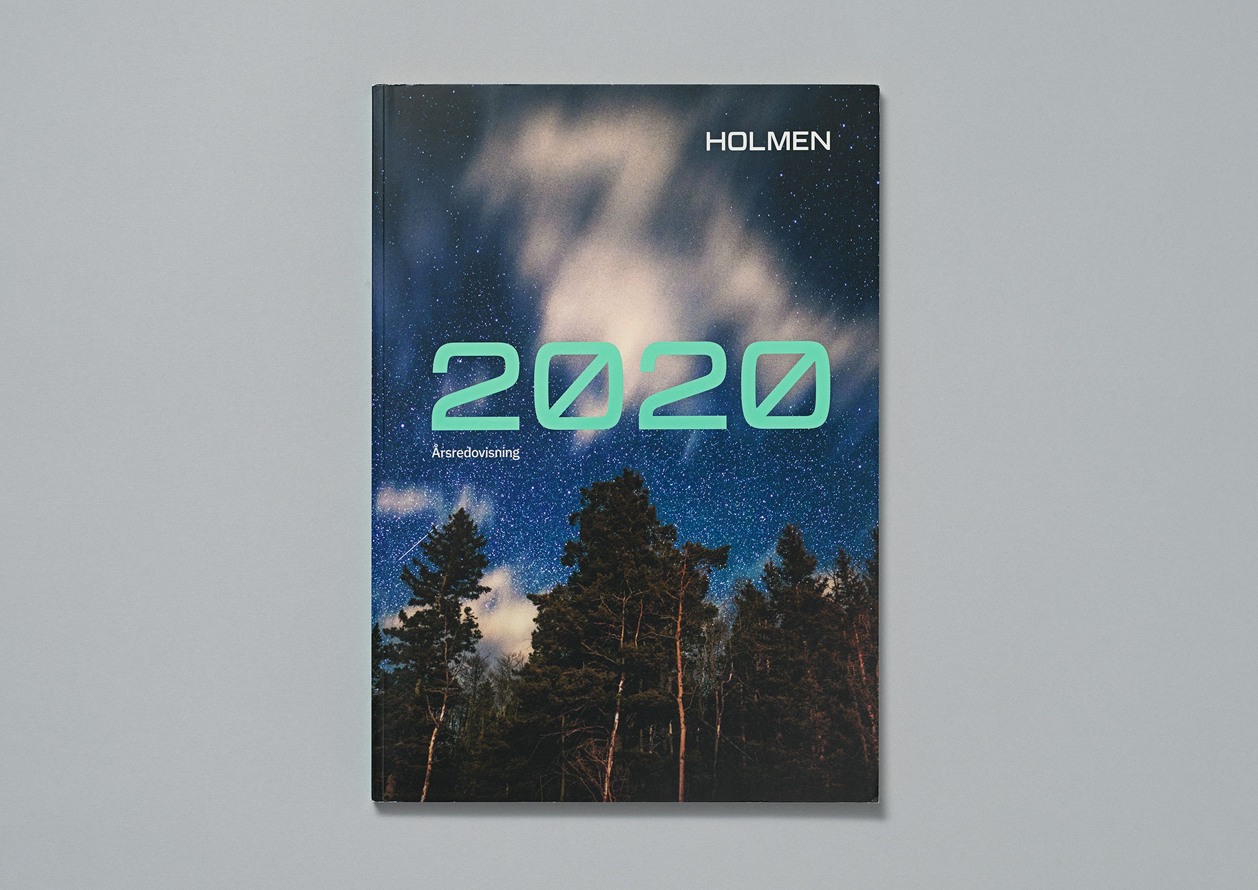
Holmen is one of Sweden's largest forest and energy companies. As part of their new visual identity we crafted a custom typeface born from their new logotype.
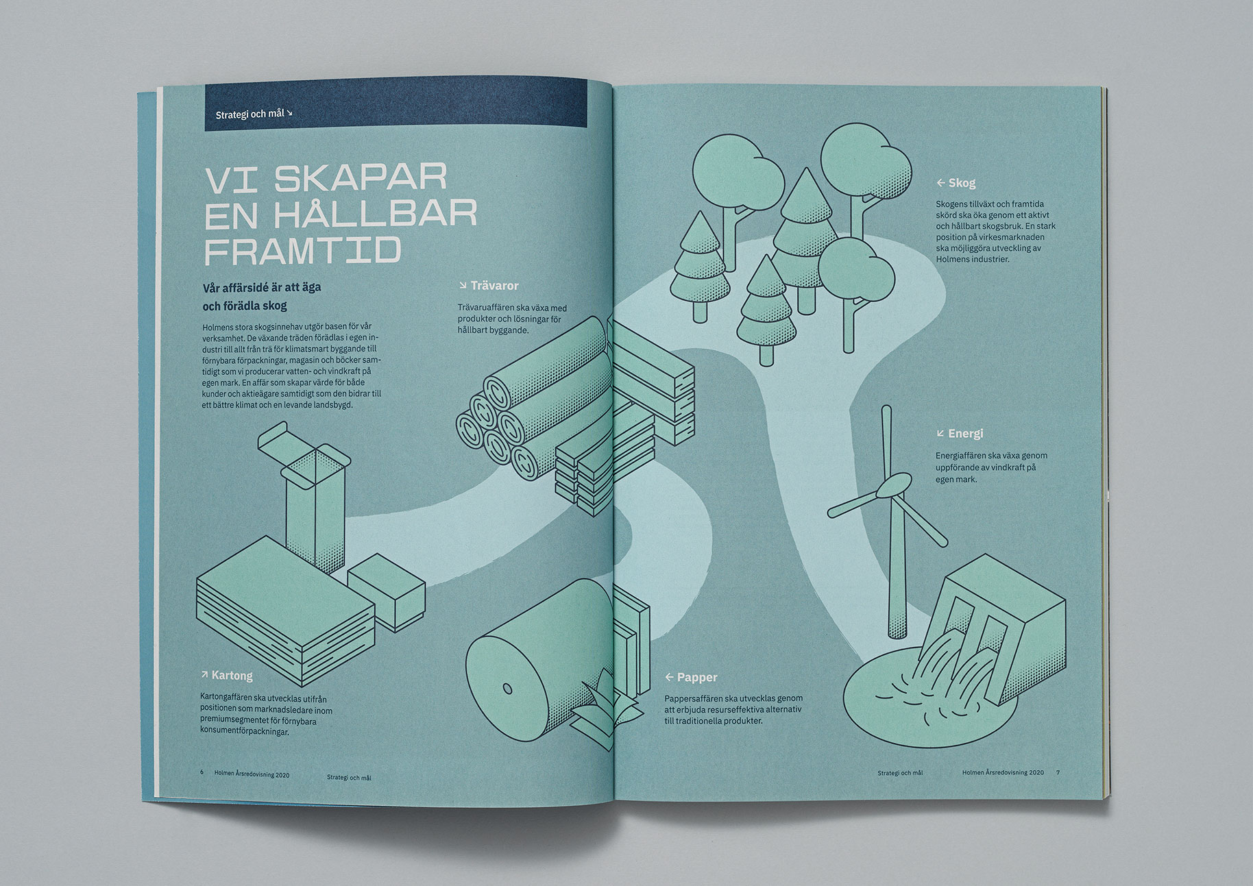
The design of Holmen typeface embraces the idea of ‘Natural technology’. Holmen is a technology-driven company that wants to drive a sustainable future. The result is a monospaced font with a modern and technical feel. This fusion between technology and nature is represented by the combination of sharp and round corners in the design. This duality became an important feature that makes the design unique. Lettershapes are built as blocks that create compact and solid text lines.
All the letters are uppercase and the font family includes two weights, Plant (Light) and Tree (Regular). The characters are intended to be used at large sizes on top of imagery and coloured backgrounds. The brand identity incorporates a dynamic letter ‘H’, working as a variable font, changing in width and weight to adapt to different contexts and proportions.
In order to address the undesired uneven rhythm created by monospaced characters, some punctuation marks use half-width and the fonts include alternates as a kerning trick. The width of the characters remains constant while the letters grow to the right, to the left, or to both sides, improving legibility and creating better text texture.
- Client
- Holmen
- Design agency
- Identity Works
- Release
- 2021
- Type design
- Noel Pretorius & María Ramos

