Art, type and geometry

by Noel Pretorius & María Ramos

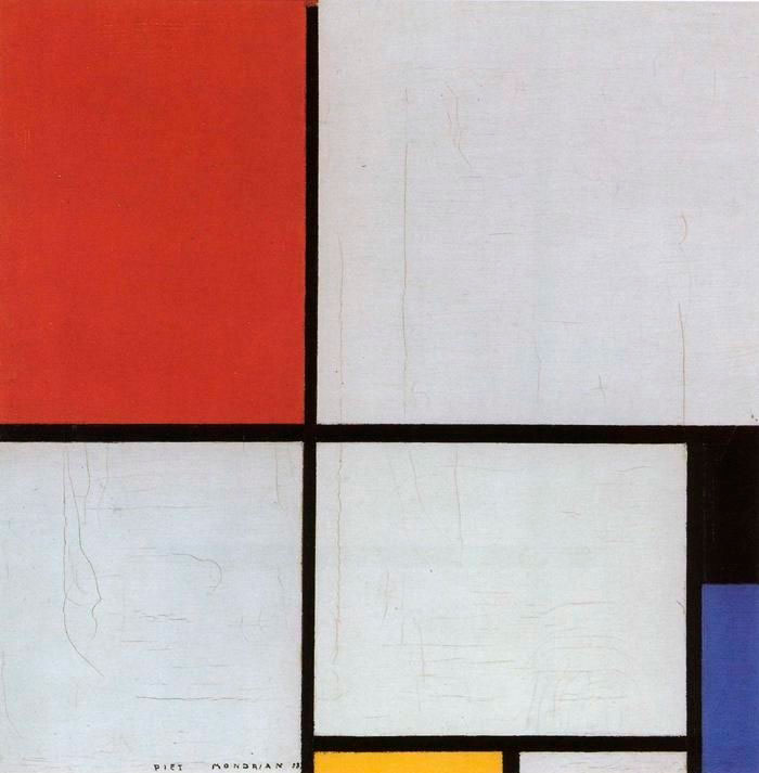
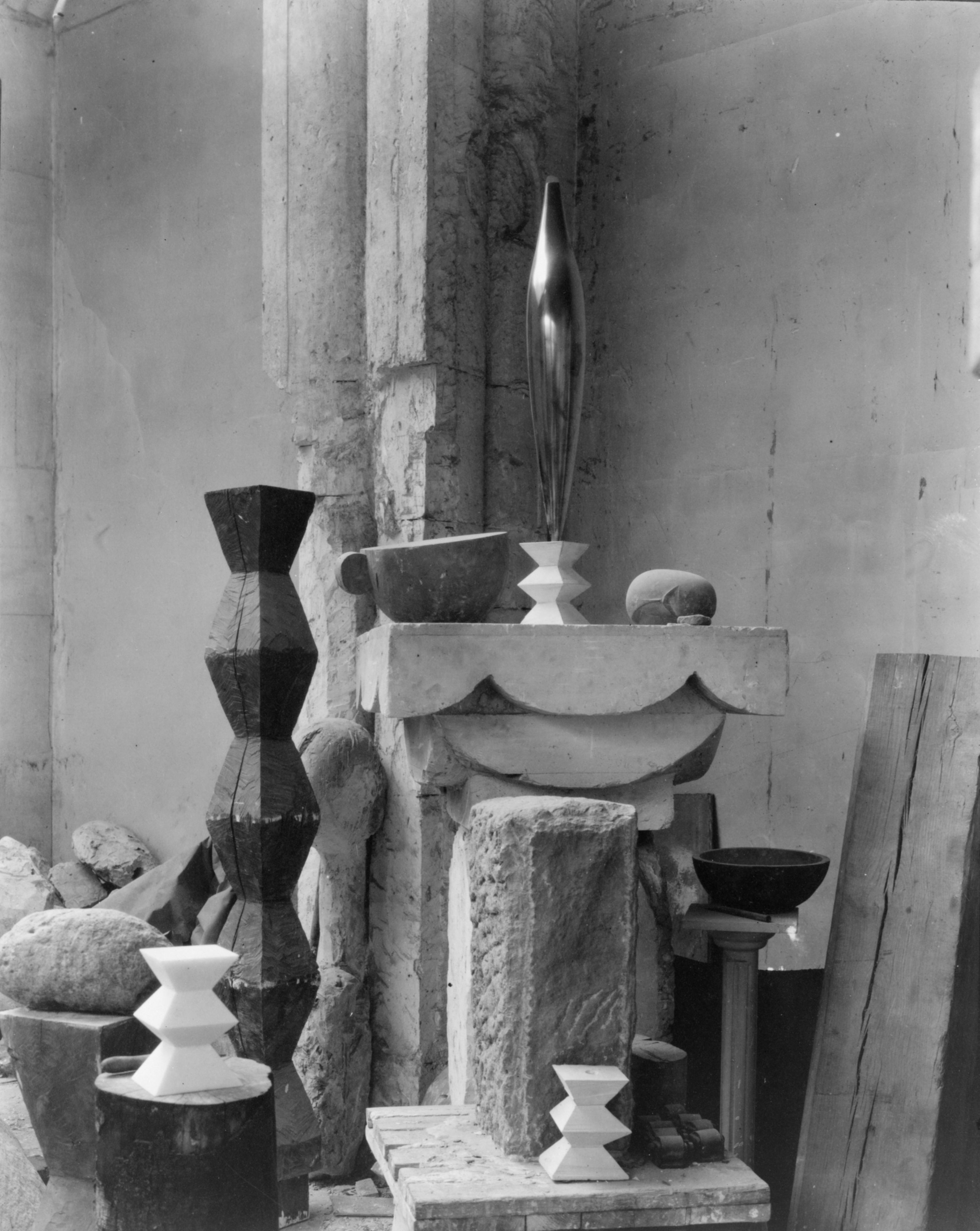
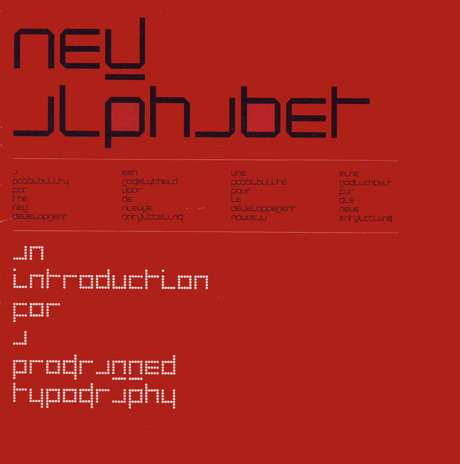
Design and art have always had a close connection. Both artists and designers mould ideas of their times. Typeface design is not an exception. Type designers follow visual trends and very often find inspiration in art forms. Kinetic is a new typeface that references art as an important source of inspiration.

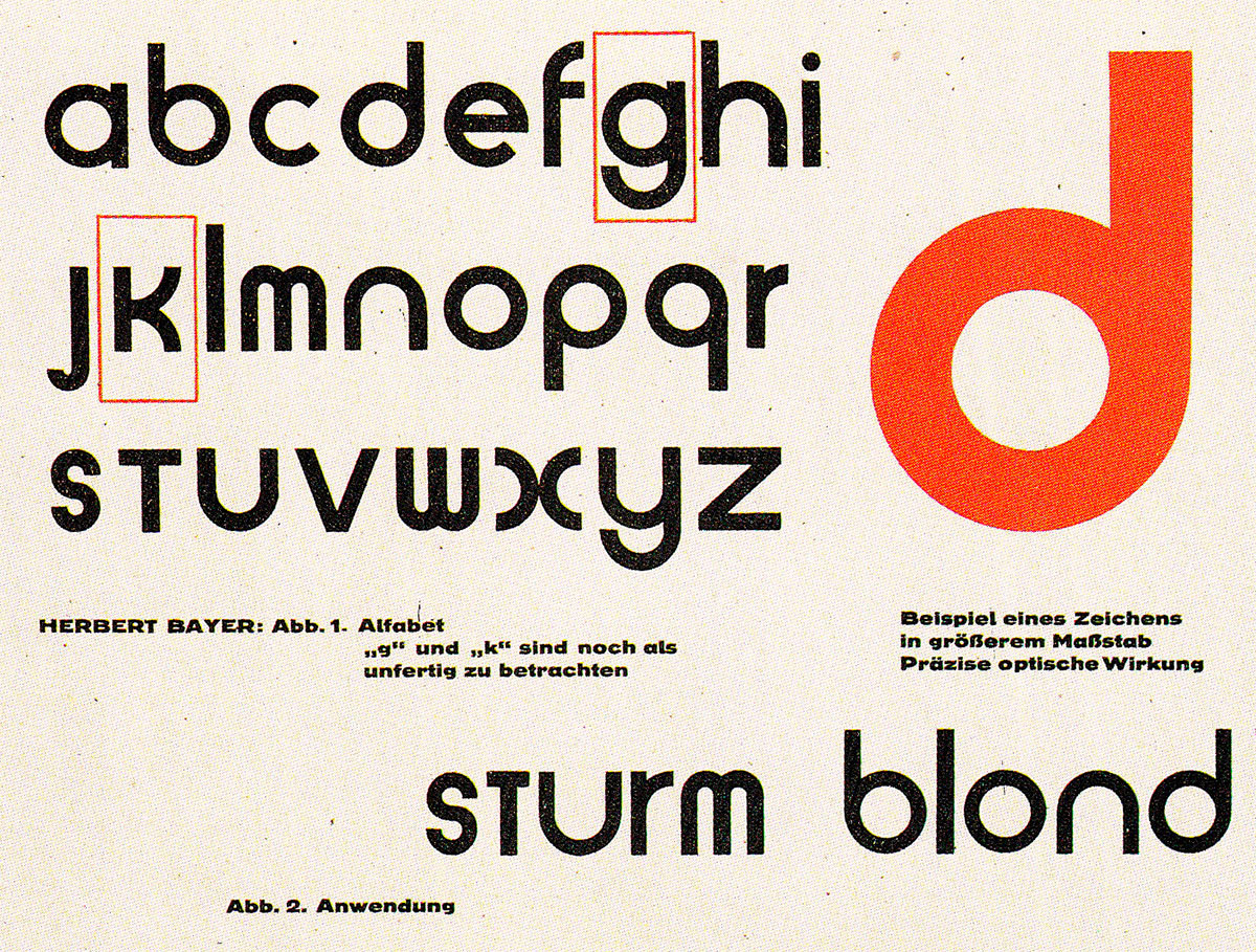
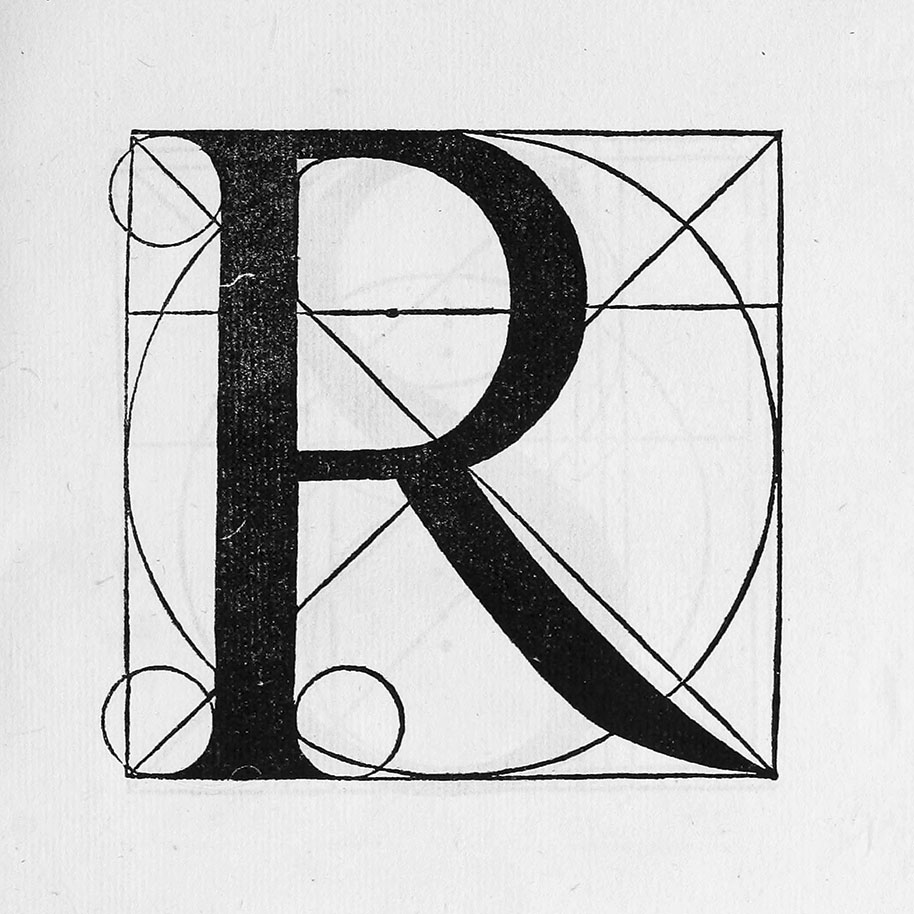
The classification of typefaces can be a difficult task. The features of a design can fit into different categories. All things considered, Kinetic will be defined as a geometric sans since geometry was a key concept from the beginning.

This article will offer some historical information of the connection between art and type, and also a few examples of the use of geometry in type. This will provide you with a context to understand this project and the reasons for the design decisions.

The influence of art on type design

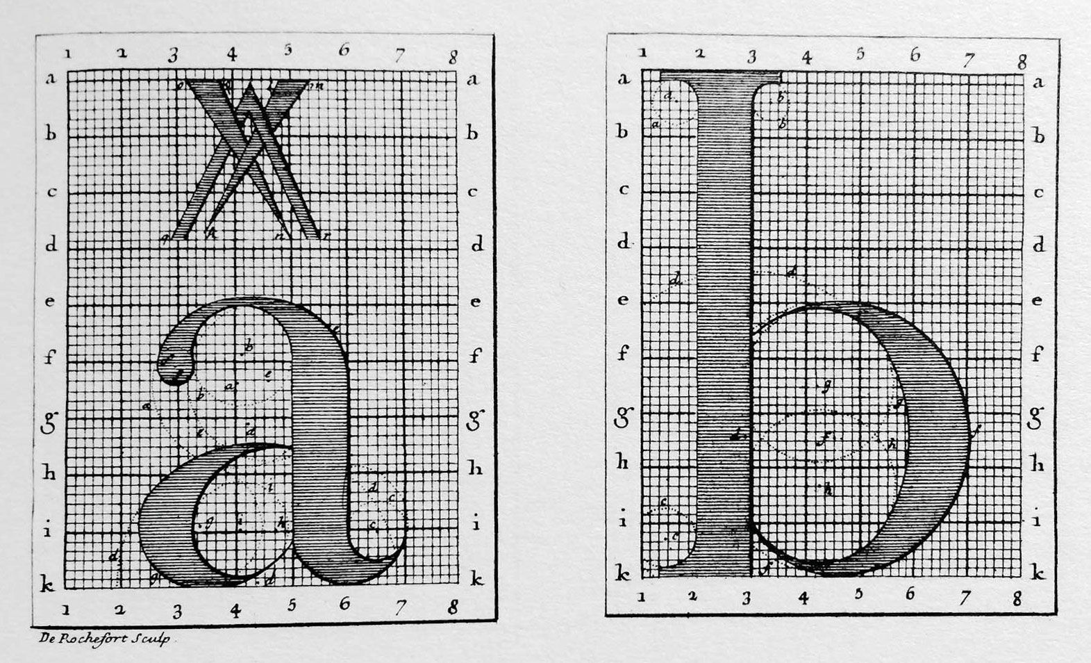
History provides patterns of how things evolve. Many type designers imitate designs that were made before them. Through history letterforms have been handed down and changed shape to reflect the time in which they were made. This is because designers do not live in a vacuum. They belong to a world that exists outside the realms of type design. They are part of a wider context where other interests such as art, music and culture often influence their work.

Fig. 1 The Forest is the Best Place, Alexander Calder (1945)

© Photo: Moderna Museet / Stockholm

Artists can be grouped in art movements because of the aesthetics and ideological similarities in their work. This shared style defines a way to express thoughts and emotions. The idea of inclusion in a particular style also applies to designers, who often include art references in their work.

Classicism had a big impact on type design. In the 18th century some designers started looking back upon earlier examples and created new designs based on previous models. The 19th century was a time of over-decorated printing. ‘The Great exhibition’ in London in 1851 became a turning point in art history as artists could continue looking back or do something new.

In the 1890s, one of the pioneers of the Arts and Crafts movement in England was William Morris. He was inspired by forms of the past. Morris was concerned about the relationship between the society, the artist and their craft. Most renowned for his flat ornamented decorations, he set up a private printing press –the Kelmscott Press– where he designed and made his own paper and type. His typeface The Golden Type (1890) was inspired by Nicolas Jenson and his early Renaissance printing types. Morris brought together inspirations from two different eras in his designs, as his letterforms were from the Renaissance and his decorations were Neo-Gothic. The early 20th century was a time of many typeface revivals of classic models, which included Plantin, Bembo and Garamond.

Fig. 2 Colophon, Art and the beauty of the Earth : a lecture

A more recent example of the link between art and typography is Modernism. Piet Mondrian, who was a contributor to the De Stijl art movement, displayed a new visual vocabulary in his modern paintings.

Fig. 3 Composition with red, yellow and blue, Piet Mondrian (1928)

It was during that same period that the typographer Jan Tschichold sought to make things of his age. He believed typefaces should be simplified to their elemental forms and restricted to a set number of weights. Like Mondrian, he wanted to display dynamic movement in his work. Their ideas were taken further by the Bauhaus art school, which was formed in 1919 upon collective theories of Russian artists. The ambition of the founder of the Bauhaus, Walter Gropius, was to unify the values of art, craft and technology. The constructivist principles were applied to typographic design through print. The Bauhaus typographers used grids and simplified decoration to geometric shapes. They considered the sans-serif to be the lettershapes of the modern age. To reflect these views, the letterform theorist Herbert Bayer designed the Universal Alphabet in 1925. It was a single-case sans-serif constructed on strict geometry, made by a compass and a ruler. When these letterforms were placed into words they did not serve the reader. The design did not include optical adjustments and the letters had unusual proportions. The Universal Alphabet was more of an experiment than something created for the reader. Bayer placed more importance on his system for simplifying letterforms than on the functionality of the design.

Fig. 4 Sample of the letters of the Universal Alphabet by Herbert Bayer

Sculpture is another art form that has been influential to type designers. Adrian Frutiger, had been interested in sculpture at an early age. Besides learning calligraphy at school he did engraving and woodcutting. Although he pursued a career in printing, his love for sculpture remained a strong influence in his design decisions. Frutiger was inspired by the art of Constantin Brancusi, whose sculptures were a fusion of geometry and biomorphism. They were focussed on essential forms. All the unnecessary elements were left out. For Brancusi this was a way to reach perfection, which Frutiger could relate to in his type forms.

Fig. 5 Brancusi’s studio (1920)

© Photo: Edward Steichen

In the 1950s Wim Crouwel began to create custom letters for the posters of the Stedelijk Van Abbemuseum. He explains the thinking behind some of his designs, ‘by selecting a special word, the name of the artist, or the name of the exhibition, I tried to translate the idea of the given artwork into a typographical or graphical way of means’. One of his earlier exhibition posters was for Fernand Léger. The shape of the letters were very different to Léger’s own letters but it was CrouweI’s typographical interpretation of his art. In Fernhout’s poster, Crouwel decided to display the horizon line present in the artist’s paintings. These are just a couple of examples of Crouwel’s type work inspired by art. He also created alphabets to express his own ideas. In 1967 he released The New Alphabet. Crouwel’s constructed shapes were a response to new technology.

Fig. 6 Booklet ‘New alphabet, an introduction for a programmed typography’, Wim Crouwel (1967)

The Dutch designer Gerard Unger references art as a great source of inspiration. In 1981 he began working on the typeface Swift. The Futurist Giacomo Balla, who was one of his favourite artists, painted lines showing the speed and movement of swift birds flying. Both type designers and artists work with straight and curved lines. The shapes that Unger found in art were visual cues he wanted to translate into type. He also referenced architecture and sculpture. For instance, he referred to Constantin Brancusi and his Le Comencement du Monde (1924) as a great example of pure forms. He admired Ellsworth Kelly and his flat colour paintings. His work fell somewhere in between the craft of painting and sculpture. Unger used the term ‘hard-edge’ –which was used to describe Kelly’s paintings– to define type design, and described this profession as a hard-edge art.

Fig. 7 Red Curve V, Ellsworth Kelly (1982)

During the 1970s the punk movement was part of the rebel youth culture in Great Britain. The anarchic visuals were inspired by underground publications of the time. Punk was a distant cousin of the Dada art movement. The British graphic designer Neville Brody was inspired by this design language. He did type design as a way to get the shapes he wanted. Type was also a tool to make a statement. The first years of Brody’s career coincided with the spread of computer based technology and his designs were representative of these changing times. He designed typefaces like FF Pop (1992), which comes with a LED version. He used geometric constructions in other typefaces like FF Tokyo (1993) and FF World (1993).

There are many examples of type designers who have been inspired by art. Some of them can be called artists themselves, as they also showed their skills in different art disciplines. William Morris or Wim Crouwel were painters first. Others like Zuzana Licko or Carol Twombly also became sculptors at a later stage of their careers.

All the examples mentioned above show that art and type design have a real link. Sometimes the connection is very obvious and sometimes it remains hidden in the design process.

Geometry and type design

In the late 15th century, Leonardo da Vinci described the human figure with a circle and a square. A similar idea was applied by Luca Pacioli to the letters in his Classic Roman Alphabet (1509). This is probably one of the earliest examples of the use of geometry to create patterns for lettershapes. He used diagrams made of a grid to illustrate the proportions of classical roman letters. With the use of a compass and a ruler he attempted to show perfect type forms. This resulted in a very rigid system and Pacioli eventually abandons his restrictive grid.

Fig. 8 Uppercase ‘R’ of Pacioli’s Classic Roman Alphabet, De Divina Proportione (1509)

It is a widely accepted assumption that punch cutters in the Renaissance did not use measuring tools but trusted their eyes for creating harmonic shapes. Jenson, Manutius and Griffo’s forms were not just reduced to geometry. This was partly due to the measured patterns of roman capitals to be very difficult to translate to the size of printing types.

During the late 17th century, the French Académie Royale des Sciences was commissioned to design a typeface for King Louis XIV. It was the origin of the Romain du Roi. All the letters in the typeface were drawn up in a precise grid of 2,304 little squares and then engraved on copper plates. The method was problematic as it was not possible to adapt the grid to the tiny size of engraved letters. The proposal from the Académie overlooked previous models that were based on handwritten forms. The Romain du Roi was built on a system that was proved to be too strict. Optical adjustments and the size in which the type would be used were probably not considered.

Fig. 9 The grid used in constructing the letters of the Romain du Roi

Caslon Egyptian (1816), which is credited to be the first sans-serif printing type for the Latin alphabet, has a clear geometric structure. This was a typeface that included only uppercase letters. The most recognisable examples of geometric sans-serif type arrived a century later.

Fig. 10 A printed sample of the Caslon ‘Egyptian’ type of 1816

A series of geometric sans-serif designs came about at a similar time in Germany. The writings of Edward Johnston were a great influence for these new designs. Johnston expressed his ideas of distilling lettershapes to their essential forms. In his writing models he included drawings of the basic skeleton of a classical Roman, using a tool that created a monoline stroke. He called these forms ‘block letters’ and used them as a branding tool for the London Underground.

Fig. 11 Johnston’s original London Underground ‘Block Letters’

© Photo: Transport for London

It was in 1927 that Paul Renner designed Futura, which is probably the most iconic geometric typeface until today. Futura was a clear statement of Renner’s views on type design. He thought neither Gothic nor Roman represented the ‘typeface of our time’ and Futura offered a solution. Unlike Bayer’s Universal Alphabet, Renner had the reader in mind, as Futura was intended for mass typography. The classical Roman capitals were used as a starting point for the design. The early sketches showed that the capital proportions were based on elementary forms, the circle, the triangle and the square. This geometric structure became also the inspiration for the lowercase letters. Renner wanted to avoid any handwritten characteristics. By removing the human dynamism of calligraphic forms he wanted to create a design that represented the ideas and style of his time. Renner agreed with the views of the Bauhaus in reducing letterforms to simple geometric shapes.

Fig. 12 Type specimen sheet of Futura Medium

 Photo: James Puckett

There were two other German geometric sans-serif designs which were released at a similar time as Futura. Erbar was created by Jakob Erbar in 1926, and Kabel in 1927 by Rudolf Koch. Erbar, Futura and Kabel shared a similar nature. These typefaces are a milestone in type design history as they helped to define a style that can be found in most type libraries today.

A new geometric sans inspired by art

One of the main sources of inspiration for the design of Kinetic was the American artist Alexander Calder. He started working with moving sculptures in Paris at the beginning of the 1930’s. A visit to Piet Mondrian’s studio in Paris had a deep impact on him. It helped him to fuse his sculptural vocabulary with the visual language of geometric abstraction. It was Marcel Duchamp who came up with the term ‘mobile’ to name his kinetic sculptures. His wire and sheet iron designs had a playful approach in their construction. Calder was not only concerned with the aesthetics of the mobile but also with the spatial quality and movement of it. Calder’s mobiles set sculpture into motion and established a new relationship between the object and viewer. He brought abstraction to life with an unpredicted rhythm.

The light, soft and playful appearance of Calder’s sculptures was something we wanted to translate into type forms. Kinetic is a geometric sans that avoids strict design systems. Although geometry is clearly present in the structure of the characters, optical corrections have been included and the design rules give room to the designers’ interpretation in each particular case. Geometry is also visible in the work of Calder, but not in a mathematical manner. For his mobiles, he used asymmetric elementary forms with blunt corners.

Kinetic is a crafted typeface that comes in 3 weights with italics. Every single character was built by the designers. There was no technical automatisation involved in the construction of the letterforms. The typeface was created with the reader in mind. The design decisions were made in order to create a functional typeface that feels comfortable to read.

The design is intended for a wide range of applications which include advertising, editorial design, and any corporate or art projects. Kinetic is a typeface appealing for contemporary design that looks good on print and screen.

It has been 200 years since the release of Caslon Egyptian, the first commercially manufactured sans-serif printing type. 100 years have passed since Edward Johnson designed the typeface for the London Underground. 2016 was a year to celebrate and we wanted to do it by designing Kinetic.

* This article was originally published in January of 2017. It is included in the booklet printed for the release of Kinetic.

Bibliography

  • Baier, S. et al. Sculpture on the Move: 1946–2016, Kunstmuseum Basel: Hatje Cantz, 2016
  • Borchardt-Hume, A. et al. Alexander Calder: Performing Sculpture, London: Tate Publishing, 2015
  • Burke, C. Paul Renner: The art of typography, London: Hyphen Press, 1998
  • Kinross, R. Modern Typography, London: Hyphen Press, 1992
  • Kuijl, T. ‘The Power of Simplicity’, Designblog: www.designblog.rietveldacademie.nl, (retrieved 02.11.2016)
  • Hochuli, J. Detail in typography, London: Hyphen Press, 2008
  • Morison, S. Pacioli’s Classic Roman Alphabet, Toronto: Dover Publications, 1994
  • Mosley, J. ‘The Nymph and the Grot, an update’, Typefoundry: www.typefoundry.blogspot.com.es (retrieved 09.11.2016)
  • Osterer, H and Stamm, P. Adrian Frutiger – typefaces: the complete works: Basel: Birkhäuser, 2008.
  • Pretorius, N. ‘Jan Tschichold and Wim Crouwel’s use of typography in graphic design’ Dissertation, University of Reading, MATD 2014–2015
  • Smeijers, F. Counterpunch, London: Hyphen Press, 2011
  • Stock-Allen, N. ‘William Morris Initiates the Arts & Crafts Press Movement’, A short introduction to graphic design history: www.designhistory.org (retrieved 05.11.2016)
  • Tracy, W. Letters of Credit, London: Gordon Fraser, 1986
  • Unger, G. ‘Swift’ Lecture, University of Reading, MATD 2014–2015, 04.02.2015
  • Unger, G. ‘Modernism and Modern Classicism’ Lecture, University of Reading, MATD 2014–2015, 03.02.2015